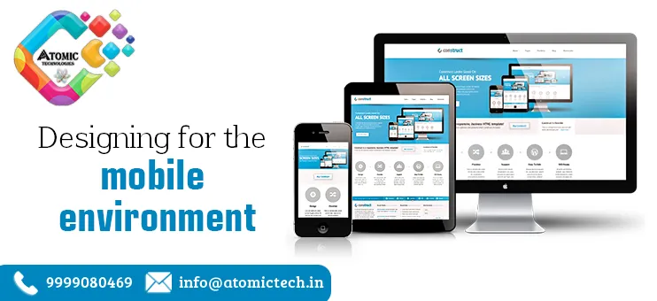
Designing for The Mobile Environment – Design is not just what it looks and feels like. Design is how it works. — Steve Jobs A great idea alone does not make a great app. Mobile UX and the design of your app are also important for great success. Let’s read more about Designing for The Mobile Environment.
What is Mobile UX Design?
Mobile UX surrounds the subjective experience that a user has with the mobile app. And this includes both good as well as bad experiences because of various reasons.
Designing for The Mobile Environment – UX design is the process of creating a product or design that is amusing to interact with and provides a meaningful experience. It includes interactions, content, and sound designs and takes the complete journey of the customer into consideration.
Don’t confuse user experience (UX) and user interface (UI). Both interact very closely with each other but are not the same. UI is a part of UX but UX is not only limited to UI.

Why is Design Important?
Designing for The Mobile Environment – The UI only includes graphic designing. Ux designs go beyond the purely graphical representation of the UI. UX is concerned with designing the experience that users have before, during, and after using the app.
The elements of a good UX design app are listed below:
Useful
The system must fulfill customers’ needs and wishes. They should be aware of what their audience wants to see.
Usable
The system must be easy to use and self-descriptive.
Desirable
The design of your system summons positive emotions and appreciation. Users must want to use your system again and again.
Findable
If any user is navigating something, your system must be easy and self-descriptive. Moreover, users must find the information quickly.
Accessible
Disabled users, like users having poor eyesight, must have the chance to use your system and have the same user experience that non-disabled users are getting.
Credible
Users must trust your design and system.

What are the Differences between Desktop and Mobile UX Design?
To give your customer’s best experience you must know the difference between desktop and mobile UX designs. You should not follow the same designs for both.
1. Size
Desktop: computers and laptops have big screens, so you can put a lot of information on one page but in an organized way.
Smartphones: if you have to shrink your website to a regular size of a 4-5 inch mobile device without changing the designs, it will look nasty and confuse the users. You have to decide which information is important to be shown in a smartphone design. If something is not required skip it or place it on the next page.
Also on desktops due to the big screen, you can arrange the content in several columns next to each other, but for a great mobile UX design you have to structure your content in just one column.
2. Screen Orientation
Desktop: website is horizontally oriented, users cannot change the formation. Smartphone: on mobile devices users have the option to change the orientation if they want. 94% of users use their smartphones vertically and 6% do horizontally. One important thing is that you have to design your mobile app in both orientations, that is, horizontally and vertically. Designing for The Mobile Environment.
3. Navigation & Input
Desktop: a keyboard and mouse are the most important common input devices for the desktop. Even if any user is having a touch screen laptop, then also they have an additional mouse and keyboard.
Designing for The Mobile Environment – Smartphone: on smartphones users don’t have a mouse and keyboard to rely on. They use their touch screen for typing or clicking on something. But if your users have to type anything, for e.g., during the sign-in process you must provide them with a keyboard to write.
4. Environment
Desktop: users mainly use laptops and computers for major tasks like in offices or shopping. Smartphones: mobile phones provide more personalization than desktops. That is why they are used everywhere in homes, restaurants, bathrooms… everywhere.
Realizing that users can access your app from anywhere leads you to understand that your app should be easy to outside also. Use color contrast properly keeping in mind that users must read everything even if the sunlight is falling on their smartphones.
5. Split Screen
Desktop: users sometimes open several websites and apps simultaneously. For e.g., on one hand, they are using your app and on the other screen, they are using a calculator. Smartphones: newly launched smartphones also support a split-screen option, but it is not a commonly used feature, definitely not as much as on desktops. Designing for The Mobile Environment.
Try to keep users on your app and offer them what they need and don’t take the users to a browser to complete the registration and login.

Why Us?
Designing for The Mobile Environment- To know more about mobile UX and get the best mobile UX for your company you can come to Atomic Technologies. We will give you the best mobile UX designs through which you can engage with more audiences.
Suggested Reads: SEO Professionals Near Me SEO Specialist in Gurgaon Top Graphic Design Agency
Logo Design and Branding Company